Final product: Semester.ly
Role: UI/UX Designer, Developer
Overall Figma Mockup:

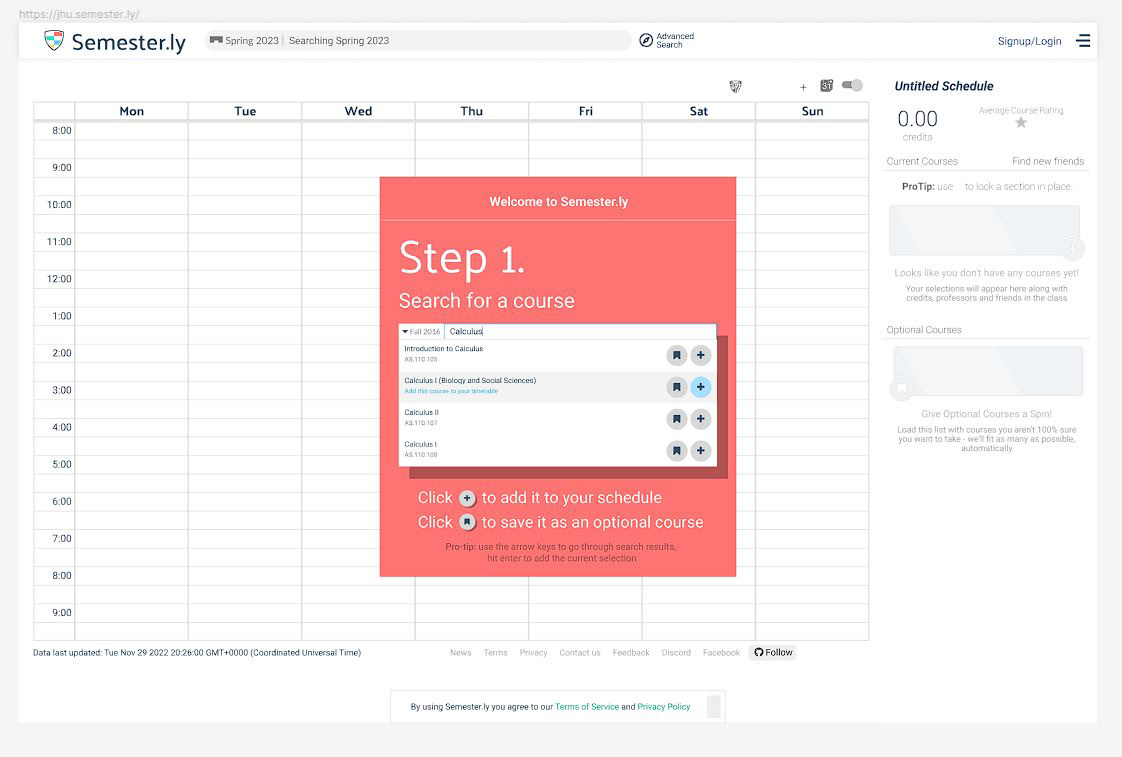
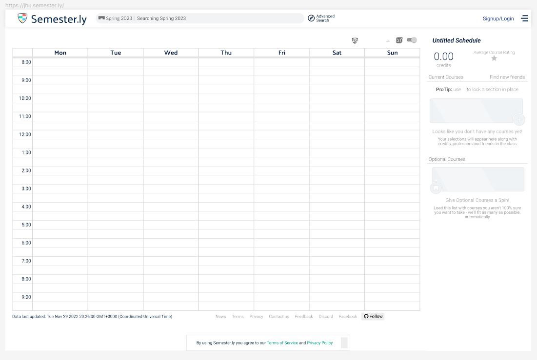
Subprojects
Darkmode
One project that our team wanted to complete was to implement a dark version of Semester.ly. To begin, I had compiled different temperatures of potential color palettes we could use on both the background and the elements of the time table, then created mockups in Figma, as shown to the side. These options were then polled among our target population. Overall, students had most preferred cool darks, which was then implemented into further mockups on how dark mode interacts with modals and other parts of the page, as shown below.
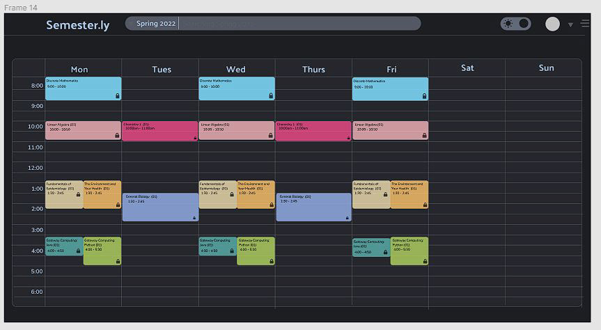
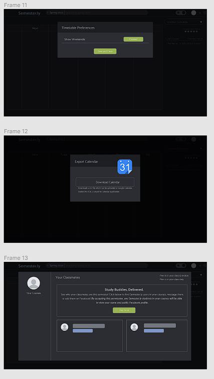

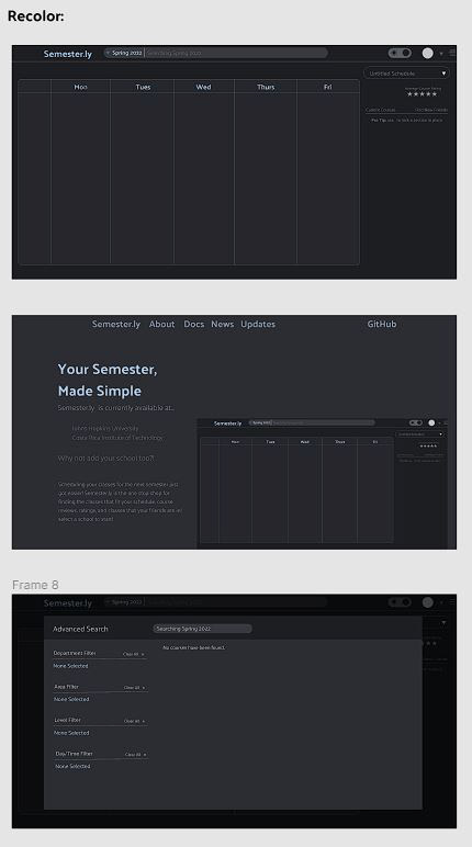
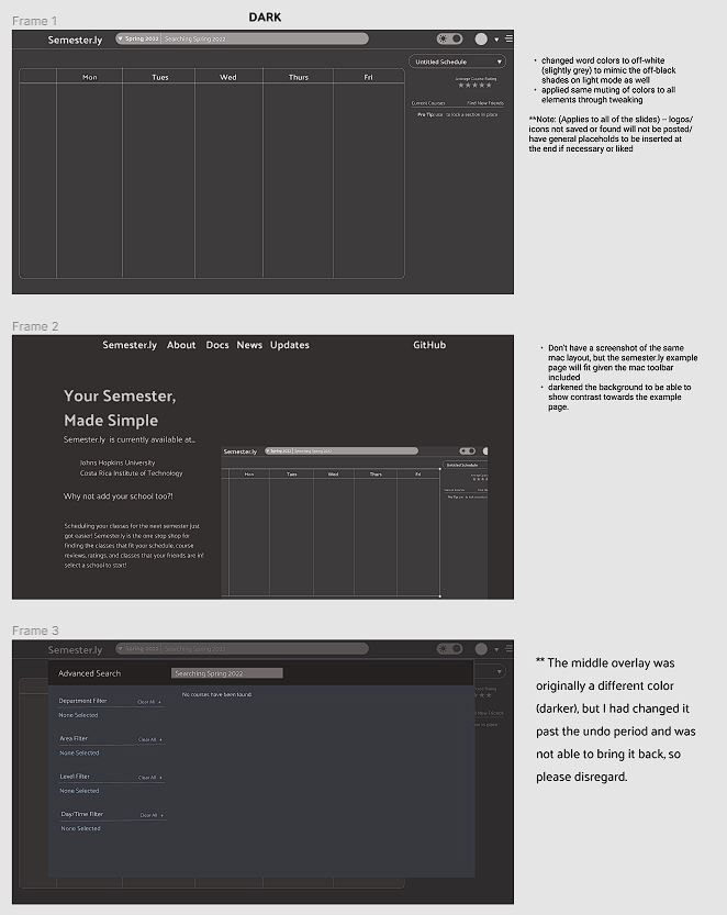
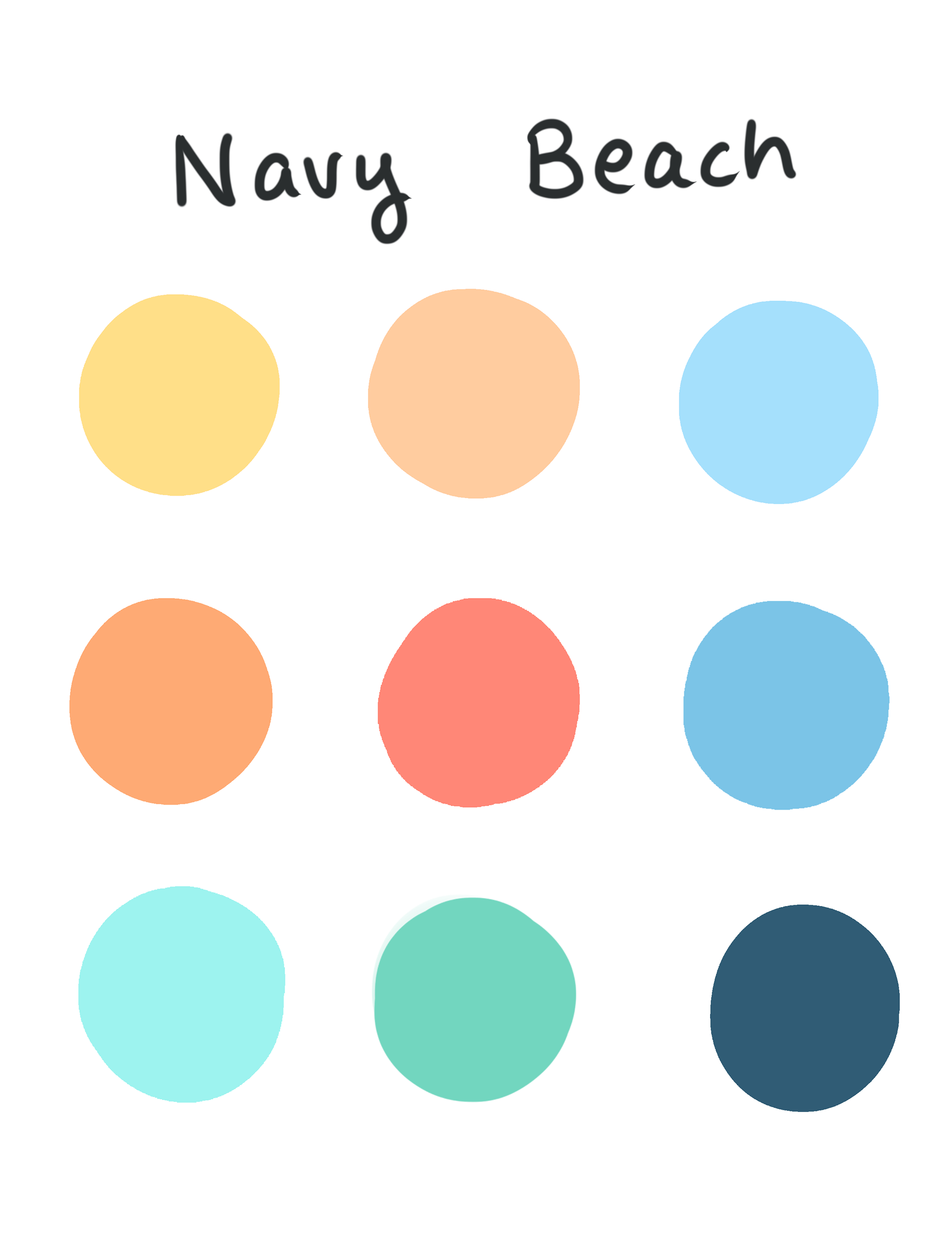
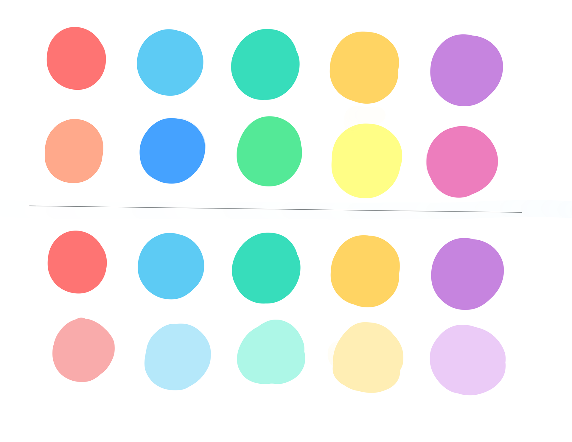
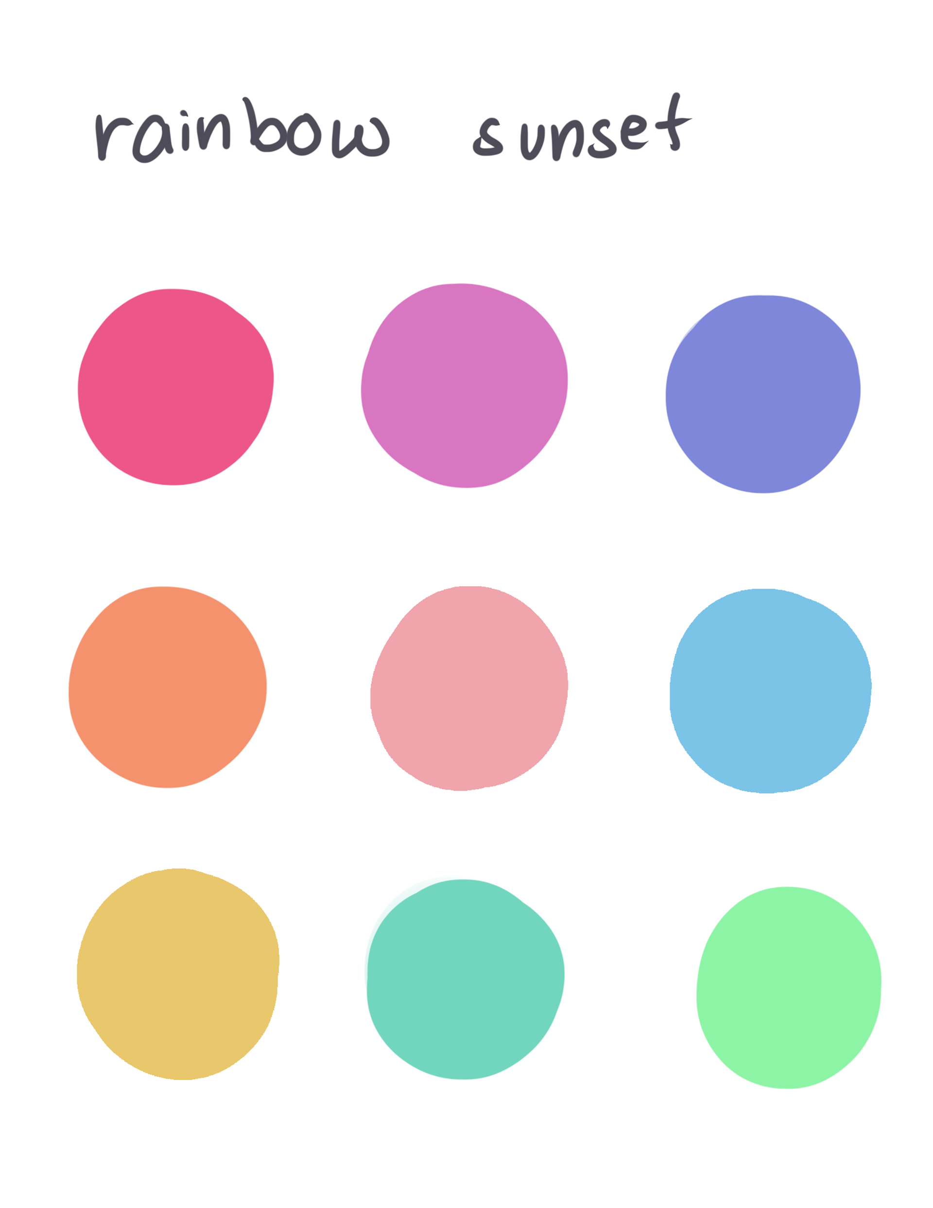
Shown to the right are the color palettes created for the elements of the timetable itself, as a response to users that they would need more improvement.
Creating drop shadows for modals
Initially, the team had different visions for the visuals on the drop shadows for our modals so they looked more like modals to the user. There was debate on which would look the best, so I had initially drafted up the following options as discussed in our meetings to help solidify ideas that the members had. From here, I had implemented them into a higher-level mockup in Figma, and sent out a poll to our users.
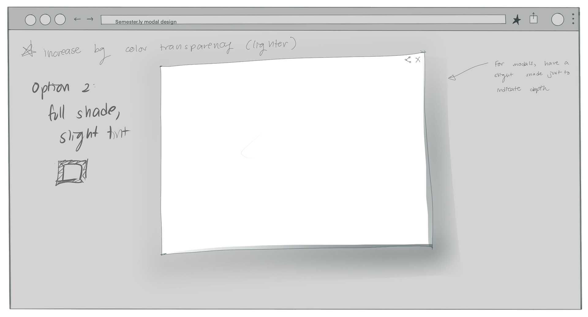
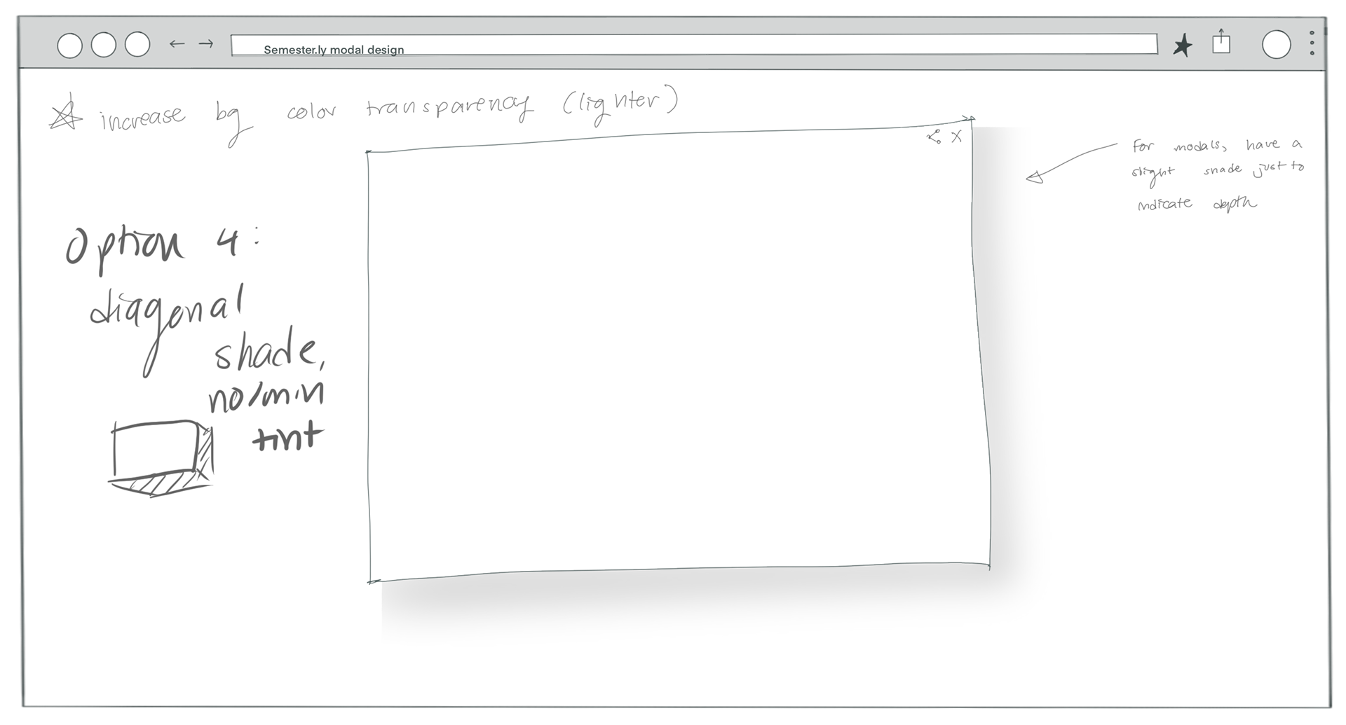
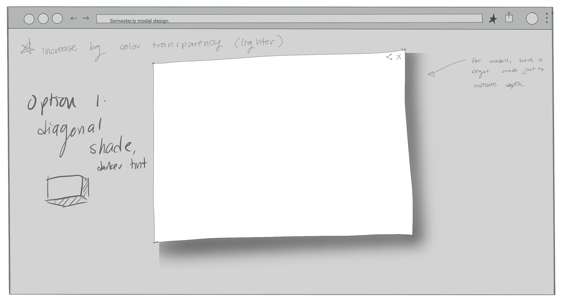
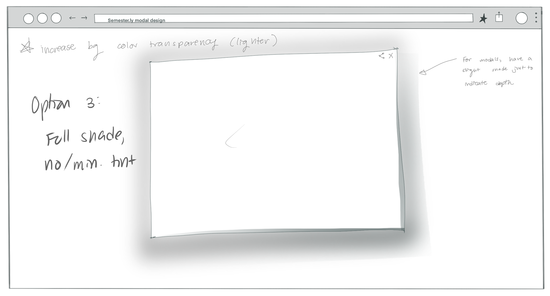
Notes discussed with the team:
- Rounded corners will help the site look more welcoming
- Could also have smaller and kinder drop shadows on a very light background
Compare Timetables
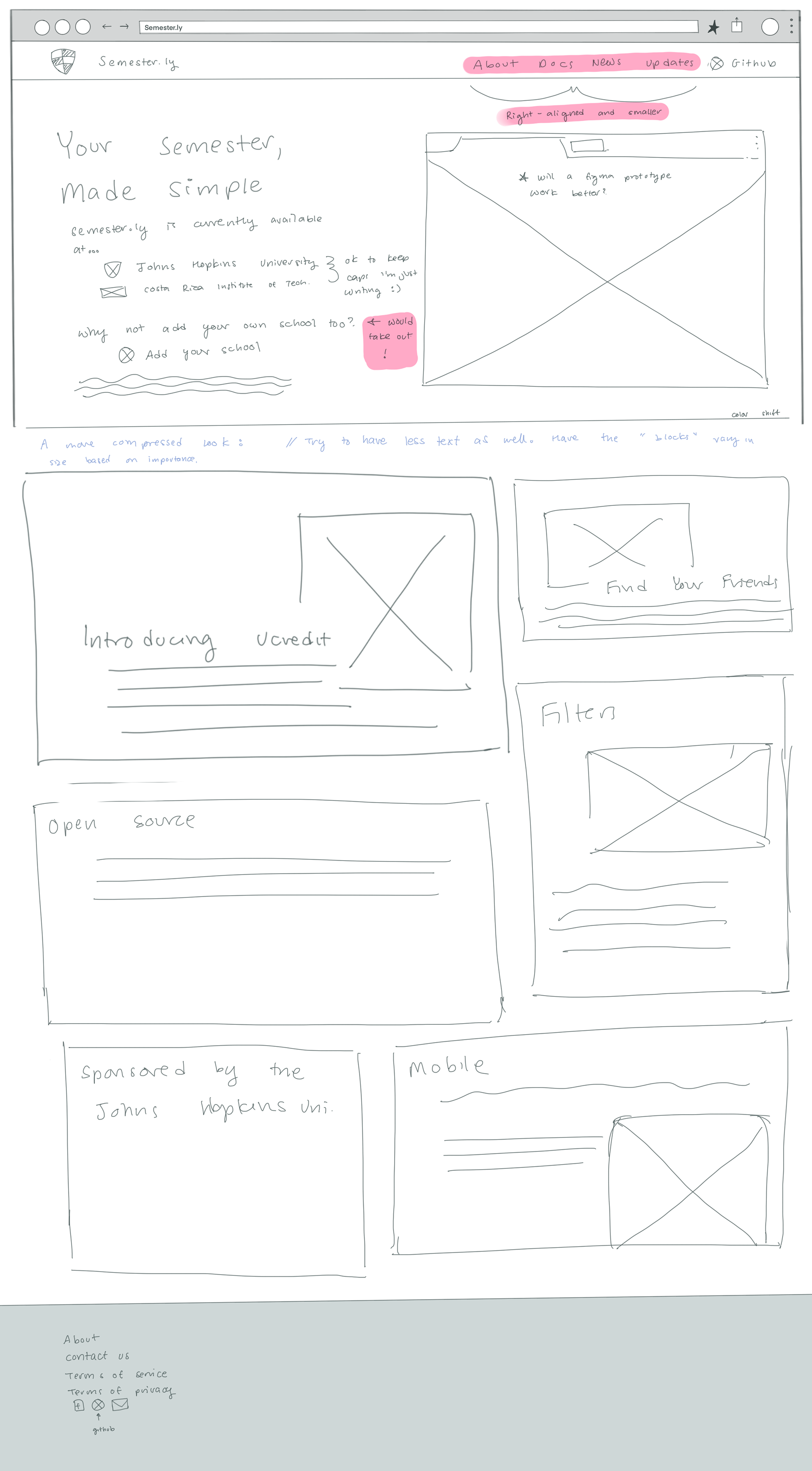
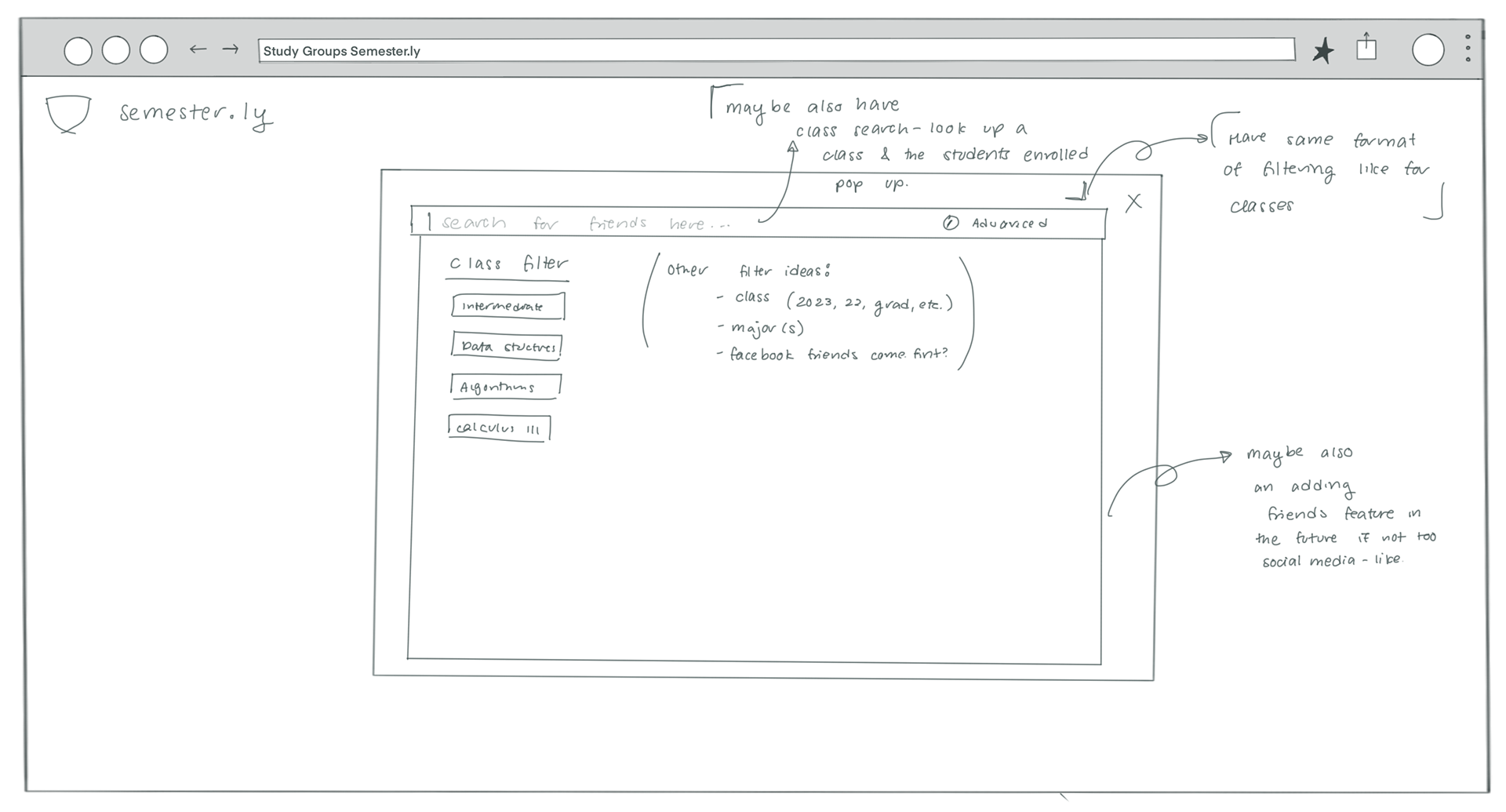
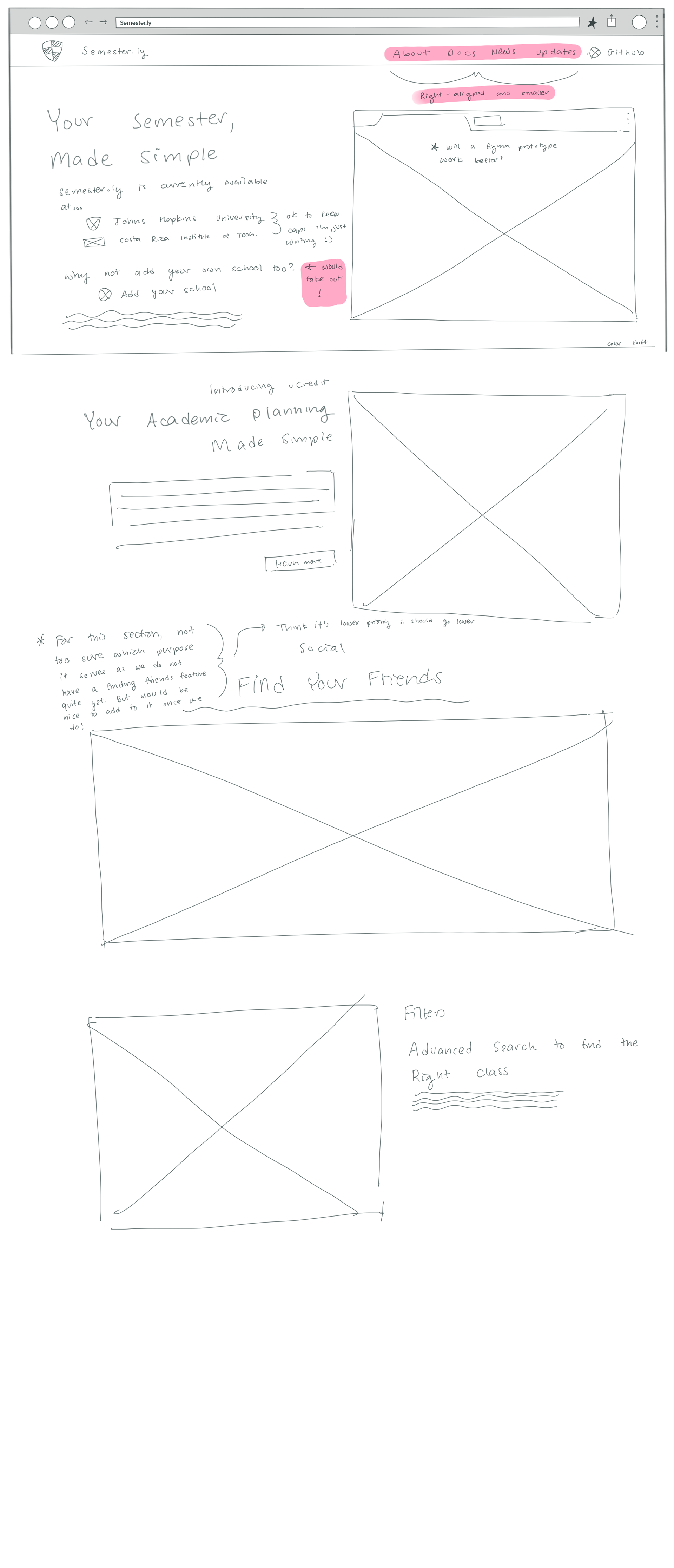
Initial Wireframes
These are among a few of the starting wireframes created to better visualize our interface.
User Research
Sample User Journey Map
